Thursday, February 2, 2017

Financial Sense News Hour

I was recently interviewed by Cris Sheridan of the Financial Sense Network (www.financialsense.com).  The interview can be downloaded at the following link:


In it we discuss the possibility that 2017 will witness an extreme "blow-off" in the stock market followed by a major sell-off later in the year.  Special thanks to Cris and everyone at FSN.

Why stock market analysts will be wrong about 2017

We’re already a month into New Year and there has been an ample amount of sentiment data to suggest that investors, both retail and institutional, aren’t terribly enthusiastic on the stock market outlook for 2017.  Granted that institutional analysts are still bullish, as per usual, but in the round table type opinion polls I’ve seen they’ve apparently lowered their expectations.  Everyone seems to be preparing for a somewhat disappointing year based largely on the assumption that after eight years of a bull market, surely another major rally is out of the question.

The decennial rhythm we discussed in an earlier commentary argues against these diminished expectations.  Indeed, seventh year of the decade tends to be one of unusual volatility for stock prices.  While it’s true crashes, corrections and panics are quite common in the seventh year (e.g. September 1987, October 1997, February/August 2007), the seventh year also sees a pronounced tendency for sustained rallies in the first seven months of the year.  Accordingly, 2017 could be a year filled with tremendous opportunity for making money in the stock market – in both directions. 

For 2017, the 10-year rhythm equates to 2007.  As you recall, 2007 was a momentous year characterized at once by great volatility alternating between great fear and euphoria.  It was the year that saw the last major stock market top and also the onset of the credit tsunami which overwhelmed the market the following year.  If the decennial pattern holds true, 2017 should witness both a meaningful rally to new all-time highs as well as a decline of potentially major proportions.  In short, it could turn out to be a big year for the bulls as well as the bears.

As for the idea that the bull market is getting “long in the tooth” and has therefore exhausted its upside potential, consider that the previous two years could well be characterized as a stealth bear market.  The major large cap indices essentially went nowhere in 2015-2016 while the Russell Small Cap Index (RUT) experienced a 25% decline.  That’s a bear market by anyone’s definition. 

Retail investors have also been quite pessimistic since 2015 in the overall scheme of things.  From the start of 2015 up until the election, more than $200 billion was pulled out of U.S. equity funds and ETFs, while a bit more than that was funneled into bond funds and ETFs.   That two-year stretch of risk aversion, however, is apparently ending as investors have gradually embraced more risk tolerance since the election.  Since the election nearly $46 billion has flowed into U.S. equity funds, while nearly $3 billion has left bond funds, according to money flow statistics.

The evidence strongly suggests that the past two years served the purpose of clearing out the excesses generated by the long-term bull market which began in 2009.  In other words, the market is rested and ready to resume its potential as we head further into 2017.

Another concern among investors is that the rise in interest rates since last year could stifle the stock market’s upside potential.  While it’s true that sustained periods or rising Treasury yields have often proved a hindrance to higher stock prices, there is an exception to that rule.  According to LPL Research, there have been 11 periods of rising interest rates (at least a 1% rise in the 10-year Treasury note) since 1996, each lasting an average of six months.  During those times, the S&P 500 rose an average of 5.44%, thus proving that in the early stages of rising interest rates stocks and yields often rise simultaneously.

We’re at a point in the long-wave credit cycle where interest rates are ready to rise after being depressed for years.  According to K-Wave theory, after the 60-year economic cycle bottomed in 2014 we should see a gradual increase in rates as the economy recovers its former vigor.  Of course this process will take a long time to complete – possibly decades – but we’re likely at a point in the newly formed 60-year cycle where even a temporarily sharp run-up in rates won’t damage the economy or even necessarily hinder the stock market.  In fact, rising rates at this point indicates increasing demand for credit and a corresponding improvement in the economy. 

Following is a 10-year chart of the 10-year Treasury Yield Index (TNX).  The double-bottom in the interest rate is clearly visible between the years 2012 and 2016.  I believe this marks the long-term low in interest rates for the previous long-term cycle.


As long as rates don’t rise too high, too fast it’s very possible that stock prices will rise along with Treasury yields without much interference along the way.  An added bonus to the rally in T-bond yields is that bond prices are now in a downward trend.  This should serve to discourage investors who piled heavily into the bond market in the last few years.  It should also cause them to look more closely at stocks as a long-term investment once again, especially as painful memories from the 2008 crash gradually wear off.  The underperformance of corporate debt vis-à-vis equities should also encourage investors to take a second look at the stock market.  Below is the 1-year graph of the Dow Jones Corporate Bond Index.


The bottom line is that 2017 should see an increase in business activity across the board as the U.S. returns to a normal business cycle after being artificially suppressed by the actions of central banks for years.  Moreover, the decennial rhythm suggests that except for a period of potential weakness in the August-October time frame, year 2017 will likely prove to be a memorable one especially from the standpoint of the upside potential in both the equity market and the U.S. economy.

Thursday, January 19, 2017

Dow 20,000: A new beginning…or the beginning of the end?

After touching the benchmark 20,000 level last month, the Dow Jones Industrial Average has spent the last five weeks in a tight, narrow trading range just under this level.  Famed trader Jesse Livermore theorized in his pseudonymous book, Reminiscences of a Stock Operator, that stocks are attracted to major round number levels.  In the case of the Dow, the 20,000 level has generated more press and speculation among investors than any number since the formerly mythical 10,000 level was crossed in 1999.  Clearly Dow 20,000 carries a tremendous psychological significance, even if it’s a simple case of self-fulfilling prophecy. 

While the technical significance of Dow 20,000 can be endlessly debated, the action of the Industrials in the weeks following the first test of this level is of more immediate concern.  To wit, does the action of the last several weeks represent a normal consolidation (i.e. a “pause that refreshes”), or is it indicative of distribution (i.e. informed selling)?  The NYSE tape doesn’t suggest distribution since the new 52-week high-low differential has been mostly healthy in the last few weeks while market breadth has also been confirming, and in some cases leading, the advance.

It’s possible, however, that the extended effort to push above Dow 20,000 could be the prelude to a distribution phase.  In an earlier commentary we discussed the distinct possibility – based on the “echo” of the 10-year cycle – that the coming months could witness a blow-off interim top, followed by significant decline at some point later in the year.  Historically such declines have occurred in the late summer/early fall months, particularly in the seventh year of the decennial rhythm. 

A run-up above the Dow 20,000 level, should it occur, would undoubtedly generate lots of enthusiasm among the hold-outs in the retail investor camp.  There’s still a huge amount of money on the sidelines right now with small investors still skittish about buying stocks at current valuations.  But greed is a persuasive argument, and if the Dow breaks out decisively above 20,000 in the coming weeks it would serve as a magnet for sidelined money.  One thing that investors can’t stand more than anything else is watching an historic rally while they’re sitting in cash and not participating.  A breakout above 20,000 would likely trigger the primal instincts of these non-participants. 

Although the 20,000 level carries great psychological significance its technical significance hasn’t yet been cemented.  In order for 20,000 to become technically significant it must be established as a “seldom crossed line.”  A seldom crossed line is a concept developed by the late market technician P.Q. Wall.  Wall emphasized that when an individual stock or market index crossed an important price level only a few times in its history, the level takes on added significance as both a support and resistance level.  He wrote:

“If cycles exist at all there must by that very fact be equidistant lines of price on a vertical scale that rise as more energy enters the market.  These should be seldom crossed lines between which price tends to cluster about equilibrium points that mathematicians would call strange attractors but that we call magnetic midpoints….Electrons in an atom rise and fall in just such stair steps.”

Take for example the chart of the Dow Industrials shown below.  While many investors touted Dow 10,000 as a critical level back in the late ‘90s and early 2000s, that particular level was actually crossed many times on both the upside and the downside.  By Wall’s reckoning, this invalidated the 10,000 level as having major significance as a long-term support or resistance level – as history subsequently proved. 


Wall believed that when a stock’s price encountered resistance at a key level without breaking above it then finally succeeded in breaking out the rally that followed would be noteworthy.  For the Dow, the closest thing to a seldom crossed line is the 14,000 level.  This was established as a pivotal level when the Dow broke out above it in 2013, then proceeded to rocket all the way to the 18,000 level before wavering.  In the future, any major decline that tests 14,000 is likely to be turned back due to the established technical significance of this level.

As for Dow 20,000 you can see in the following snapshot of the last three months’ worth of trading action that the level in question hasn’t been penetrated on the upside yet.  This is an important first step toward the establishment of a seldom crossed line.  The Dow has yet to lay claim to this important designation of the 20,000 level, however.  The key ingredient here is time and the reaction of the Dow’s price line to this pivotal level in the coming days.


If Dow 20,000 turns out to be a seldom crossed line then the next attempt at breaking above this level should see an explosive rally with no immediate reversal.  In other words, it should cross above 20,000 only once and not look back for a while.  Accordingly, the next few weeks should be quite interesting and potentially historic depending on how the market behaves once 20,000 is finally crossed.

Thursday, January 12, 2017

Biggest challenge of 2017 directly ahead for gold, stocks

If you thought the pace of the head-spinning political events of the last two months couldn’t get any faster, think again.  One of the most critical decisions of President-Elect Trump’s reign will soon be decided.  The final verdict will have a direct impact on the direction of stocks, gold, and the economy in the months to come.

The decision in question is the Congressional challenge being made against the Affordable Care Act (ACA), also known as Obamacare.  Specifically, the requirement that individual Americans carry health insurance or else pay a stiff financial penalty is being challenged.  Earlier this week, Trump directed the Republican-led Congress to begin efforts at repealing and replacing the health care law “very quickly.”

The mainstream news media is sparing no expense in its efforts at turning public sentiment against a repeal of the healthcare law.  CNBC reports that “the number of people who owed Obamacare fines last year dropped by about 20 percent, while the number of Americans who benefited from financial aid for Obamacare plans grew to more than 5 million.”  The latest data was culled from 2015 tax returns to the Internal Revenue Service. 

IRS Commissioner John Koskinen said the number of people receiving Obamacare subsidies was up from 3 million in 2014.  For that year, customers got more than $10 billion in tax credits, with an average subsidy of $3,430 annually, according to the IRS.  Obamacare subsidies are available to wage earners with low and moderate incomes.  People who earn less money get more in assistance than higher earners.

Koskinen wrote that about 6.5 million taxpayers last tax season reported owing a total of $3 billion in such tax penalties for failing to have coverage in 2015.  In contrast, about 8 million people owed an Obamacare fine for lack of coverage in 2014.  Fines related to lack of coverage in 2014 totaled $1.6 billion.

CNBC reported that some 12.7 million people claimed one or more exemptions from the ACA-coverage mandate when they filed their taxes last year.  “The exemptions are wide ranging and can include having very low income, being incarcerated or having a close family member die recently,” according to CNBC. 

While pro-Obamacare media outlets such as CNBC are touting this news as confirmation that the ACA is “working,” the gorilla in the room is conveniently ignored.  The reason for the decline in Obamacare fines last year is that millions of Americans experienced a significant drop in income, which ironically is a direct result of the economic damage inflicted on businesses by the financial strictures of the ACA. 

CNBC also reported that the Republican-led Congress last week began taking steps toward repealing key parts of the ACA, which include the funding of premium subsidies and the individual mandate.  For the middle class’s economic sake, let’s hope the effort is successful.

You may be asking what all of this has to do with the price of gold or the stock market.  The answer is “everything!”  Repealing the individual mandate would serve as a huge catalyst for the U.S. economy and financial market.  It would lift a grievous burden from the shoulders of working-class Americans and would serve as a stimulus to consumer spending.  Economics 101 establishes that when wage earners are allowed to keep more of their income, they’re less likely to think twice about spending and investing it. 

One of the big reasons for the Nowhere-ville sideways trend in stock prices in the last couple of years is because people have been forced to think twice before spending or allocating money into investments due to the constraints of the ACA.  Pollsters have consistently underestimated the number of healthy individuals who choose not to carry expensive health insurance because they don’t consumer healthcare services.  Now those healthy individuals are being punished for their lifestyle choices by being forced to pay upwards of $1,000 per year in the Obamacare tax simply because they choose not to be insured.  This is an assault on personal liberty and common sense, and it has created a massive obstacle to full economic recovery. 

What can investors expect if the Obamacare tax penalty is soon repealed?  First, there will be an immediate uptick in consumer spending and overall economic activity.  Americans are always looking for an excuse to spend, and if they’re provided with what amounts to a massive tax cut they’ll express their relief by purchasing the items on their wish list that they’ve held off on buying due to personal budget constraints.  Businesses, moreover, will begin to pick up the pace of hiring since the healthcare mandate is no longer acting to suppress business investment spending.

A repeal of the ACA’s individual mandate would also revive the fortunes of publicly traded companies which serve the middle class.  Many of these companies’ stocks are components in our Middle Class Index (below).  The Index has been languishing for the last two years, but I’d venture that an upside breakout from the lateral trading range would shortly follow an Obamacare repeal.


As for gold, a repeal of the individual mandate would also likely have far-reaching consequences.  Gold’s fortunes would be helped, ironically, by success in getting the Obamacare tax removed.  While gold is primarily a safe-haven asset which feeds off investors’ concerns about the economic and political outlook, gold’s moves over the last two years have been closely correlated to the direction of the Middle Class Index.  As the fortunes of companies which serve middle class consumers have risen, so has gold’s price.  Conversely, last year’s major peak and subsequent decline in the Index has coincided with the July 2016 peak in the gold price and corresponding mini-collapse.

Wednesday, January 11, 2017

2017: Year of extremes

Now that another New Year is upon us, it’s time to reflect on what the coming months might unfold.  Normally when market analysts try their hand at predicting the year ahead it involves either wild guessing or linear extrapolation based on prevailing trends.  I tend to eschew both methods and instead focus on comparing past events in comparable time frames.  This method is based on something known as Kress cycle “echo” analysis and was pioneered by my late mentor, Samuel J. Kress. 

The year 2016 was filled with ups and downs, but was mainly a torpid year with stock prices stuck in a dull trading range for much of the spring and summer.  It continued a theme of directionless and no progress from the prior year, which, combined with the after-effects of the preceding slow-growth years, culminated in a disaffected mindset on the part of the masses.  The result was clearly seen in the outcome of the 2016 U.S. presidential election.

One of the most reliable of the long-term market rhythms (or “echoes”) is the 10-year (decennial) pattern.  This is often erroneously referred to as a “cycle” despite not fitting the technical definition of one.  The 10-year rhythm was famously expounded by the late market analyst Edson Gould and by Edgar Lawrence Smith in his book, Tides in the Affairs of Men.

The seventh year of the decade tends to be tempestuous and often sees extraordinary volatility.  It’s a year filled with extreme ups and downs and not uncommonly witnesses both a major high and a major low within the year.  In recent decades, the seventh year has witnessed the market making impressive strides, yet not without its share of turmoil.  Crashes, mini-crashes and panics are quite common in the seventh year (e.g. September 1987, October 1997, February/August 2007).  It will do us well to keep this in remembrance as we enter what promises to be a year filled with tremendous opportunity for making money in the stock market – in both directions. 

For 2017, the 10-year rhythm equates to 2007.  As you recall, 2007 was a momentous year characterized at once by great volatility alternating between great fear and euphoria.  It was the year that saw the last major stock market top and also the onset of the credit tsunami which overwhelmed the market the following year.  If the decennial pattern holds true, 2017 should witness both a meaningful rally to new all-time highs as well as a decline of potentially major proportions later in the year.  In short, it could turn out to be a big year for the bulls as well as the bears.

Now what about the economy in the coming year?  Year 2016 ended on a positive note, with the last meaningful economic news in late December being the revelation that U.S. consumer confidence had hit a 15-year high.  The Consumer Confidence Index hit 113.7 in December, exceeding economists’ expectations of a 109 reading.  The reading was the highest since August 2001.  Rising sentiment among consumers implies an optimistic economic outlook in the wake of Donald Trump’s election win.  The following graph is courtesy of the Trading Economics website (www.tradingeconomics.com).


For many in the middle class, Trump’s win has provided a reason for genuine hope for the first time in years.  Whether this hope will ever be fulfilled is a matter for conjecture.  What’s important from a market perspective is how consumers and investors respond to that hope.  To that end the appropriate question to ask is, “Will 2017 be the year that retail investors finally return from the sidelines?” 

For the year-seven decennial pattern to repeat, as it has in the three prior decades there must be not only a continuation of rising consumer confidence, but an acceleration in investor optimism as well.  To this end, it would seem necessary that small investors return from the sidelines and put their money back into the stock market.  After years of being stuck in the bomb shelter of low-yielding bonds, this important group of participants is no doubt feeling the urge to grow their money. 

To that end, the stock market is beckoning to them – especially with so many major indices at or near all-time highs.  The fact that the man who they believe represents their interests as an economic class will be in the White House will serve to stimulate their confidence in the economic outlook.  History shows that when consumers feel good about their intermediate-term economic prospects they are more likely to invest in stocks. 

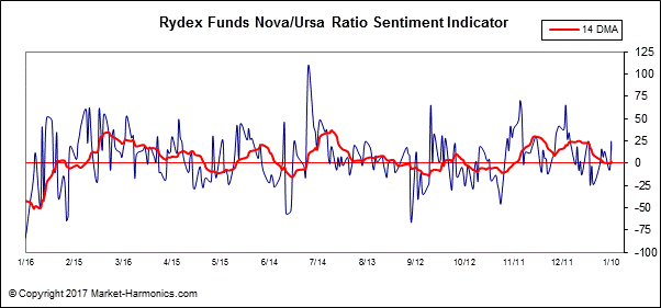
Here is what investor sentiment currently looks like according to the Rydex Ratio of investor sentiment.  We should ideally see a major spike higher in this ratio sometime this year, ideally by late summer, to let us know that the historical pattern for Year Seven is on track for being repeated.


Whether or not 2017 will prove to be the exception to the “rules” of the decennial “echo” established in the prior decades remains to be seen.  We are certainly living in exceptional times, so it’s possible that 2017 will in effect throw the historical playbook out the window.  But as the last several years have resonated to the tune of the Kress cycle echoes to some degree or other, I have to assume that there will be at least some validity to the decennial rhythm for 2017.  Remember, while history doesn’t always repeat it does usually rhyme.  

Tuesday, December 13, 2016

Why collapse isn’t on the menu

The word “collapse” instantly conjures primal feelings of both fear and excitement whenever we hear it.  We fear it because it evokes our collective belief that collapse is fatal and final, yet it excites our imagination to the possibility, however, remote, that perhaps we’ll be among the lucky few to survive and even prosper from it. 

Whether in reference to a financial market crash or the collapse of government, the very idea has given birth to a plethora of writings on the subject.  Indeed, some of the top selling books in the financial literature category in recent years have had collapse as the subject matter, for writers instinctively know they can always count on a visceral reaction from their readers whenever they write of it.

Laying aside the fear it evokes, the study of collapse is a fascinating and rewarding endeavor.  Historians have long known what financial writers have only recently discovered, viz. that writing about collapse is a lucrative industry.  Consider the hundreds of books dedicated to the decline and fall of the Roman Empire, or to any number of past civilizations (Aztec, Egyptian, Babylonian, etc.).  One of the great preoccupations of writers of this genre is the guessing game of what exactly causes a society, or an economy, to collapse.  There is invariably no consensus among historians as to how, or even when exactly, it happens. 

Consider the famous example of ancient Rome.  What was it that actually precipitated the decline and fall of this mighty empire?  While there have been hundreds of reasons offered by specialists as to the cause(s), the most commonly assigned factors can be generally summarized as follows: 1.) Immigration and assimilation of foreigners (i.e. barbarians), 2.) Failure to continue expanding the frontiers via military conquest, 3.) Loss of personal discipline and liberty; 4.) Corruption on both the administrative and personal levels. 

Even if we accept any, or all, of these reasons as being legitimate, it still doesn’t answer the perennial question of what led the Romans to decide on making such a fateful decision.  In other words, what was the ultimate reason for the decline and fall?

Financial writers are plagued by the same lack of agreement as to what causes markets to collapse.  The reasons they offer range from the prosaic to the profound.  Most commonly they assume that a market collapse is the result of asset prices being “too high” or unsustainably expensive relative to valuation.  What many don’t realize is that demand for any given asset can extend well beyond the boundaries of normal valuation for years, or even decades, at a time.  We need look no further than the Treasury bond market to see an example of this. 

It has become fashionable among collapse historians to assume that collapse often occurs without warning out of a clear blue sky as it were.  Nothing could be further from the truth.  Collapses are invariably preceded by long periods of internal weakness, whether it’s the financial market or any other social system.  This explains why strong societies, much like strong markets, can withstand any number of external shocks without toppling.  It’s only when weakness is entrenched that one can expect external pressure to cause serious damage to a structure. 

An example of this is the stock market plunge of late 2015/early 2016.  In the months leading up to it there was a sustained period of internal weakness and technical erosion in the NYSE broad market.  The number of stocks making new 52-week lows was well over 40, and often in the triple digits, which was a clear sign of distribution taking place in some key industry groups.  This weakness was evident in the NYSE Hi-Lo Momentum (HILMO) indicators, which depicted a downward path of least resistance for stocks.  The following graph is a snapshot of what the HILMO indicators looked like in the weeks just prior to the January 2016 market plunge.


This is also what stock market internal momentum looked like prior to the 2008 credit crash.  In fact, it’s what precedes every major collapse and it’s also a good representation of the internal weakness which takes place before markets, societies and empires collapse.  Look below the surface and you’ll always see the internal decay which paves the way for the coming destruction.  A healthy and thriving system, by contrast, is simply not conducive for a collapse to occur.

When we view the internal structure of the current NYSE stock market through the lens of the HILMO indicator, what do we see?  A market ripe for collapse?  Far from it, we see overall signs of technical health – even if the market isn’t firing on all cylinders.  Below are all six major components of HILMO.  The orange line is the longer-term momentum indicator, which is one of the most important one for discerning whether or not the market has been undergoing major distribution (i.e. internal selling).  It has been rising for several months now and is the polar opposite of what it looked like heading into 2016.


It would appear then that a collapse isn’t on the menu right now, at least not in the intermediate term outlook.  If it happens at all it will require a significant reversal of the market’s longer-term internal momentum currents, which in turn would likely take several months.  The weight of evidence suggests that the doom-and-gloomers who are predicting collapse are much too early and should save their apocalyptic warnings for a more propitious time.

Wednesday, December 7, 2016

The great middle class revolt gets bigger

With the U.S. presidential election now behind us, many investors feel they can finally breathe easy again after a nail-biting period of uncertainty since last year.  The rally in the major equity market indices since Nov. 9 has been in large part a relief rally of sorts and has been broad-based.  The sell-off in bonds has also been an indication of this collective relief. 

Despite the powerful stock market rally, not everyone is relieved about the election’s outcome.  There is some evidence that a large segment of the U.S. population is still feeling uneasy about the incoming president.  I’m referring specifically to the upper-middle class, which by some measures hasn’t expressed any enthusiasm in the way of increased spending patterns since the election.  Indeed, many in this socio-economic group have expressed an unwillingness to make major purchases until they see evidence that President-elect Trump’s policies are beneficial for the economy. 

The upper-middle class is roughly defined as those individuals that earn from around US$85,000 to $150,000 per year. Based on one measure of upper-middle class retail spending, they’ve noticeably curtailed their discretionary spending for at least the last two years.  Middle class spending also remains below its 2014 peak. 

Here’s a theoretical question: If it were possible to invest in either the middle class or the upper-middle class as if both were individual stocks or ETFs, which would you choose?  Logic would dictate the latter group since we are assured by economists that the upper-middle class has actually grown in recent years while the middle class has allegedly shrunk.  Moreover, upper-middle class members typically earn on average at least twice as much as the middle class average income.   So given a choice between the two, which do you think has performed better in the last couple of years?

The answer will no doubt surprise many of you; it’s the middle class.  Here’s what a middle class “ETF” would look like:


This theoretical class index is comprised of several companies which cater mainly to the middle class, including WalMart, Dollar General, McDonalds, Ford, and JC Penny.  Notice in the above chart that while most of the middle class-oriented stocks peaked in 2014, many of these stocks have actually held their own and have been trending more or less sideways since last year.  Some of them have even shown an upward bias since this year.

Now for the upper-middle class “ETF.”  Here’s the chart: 


As you can see, the upper-middle class hasn’t exactly felt ebullient since their discretionary spending peaked in 2014.  This index is comprised of stocks which cater mainly to members of the upper-middle, including Target, Starbucks, BMW, Whole Foods, Apple, and Chipotle Mexican Grill.  Evidently, the upper-middle class has felt less than enthusiastic in the last two years as the overall trajectory of most publicly traded companies who serve this sector has been, surprisingly, downward trending. 

This is not to imply that the fortunes of the upper-middle have been declining; economic statistics suggest the opposite.  Yet a distinction must be made when performing this type of analysis between having money and the willingness to spend it.  Clearly the upper-middle class has been, by and large, less willing to spend than in the years prior to 2015. 

It would be tempting to lump the trends shown in the above charts together and label them collectively as a great “middle class revolt.”  Undoubtedly that could be said about the way the middle class feels, for they made their grievances known in the recent election.  As I’ve demonstrated many times in the past, nothing is more devastating to the mass psyche than a prolonged sideways trend in the equities market.  The directionless stock market trend visible in the NYSE Composite Index (NYA) since 2014 is a case in point.  I believe that this, more than perhaps any other factor, has engendered the spirit of revolt among the middle class.


Human nature is so constituted that if progress isn’t evident over a certain period of time, people become restless.  The longer that people feel they aren’t progressing, the more restless they become.  This explains why, almost without exception, every political or military revolution in industrialized countries occurs after a prolonged trading range in that country’s equity market.  In the case of the U.S. middle class, it’s not that this class is actually getting poorer; rather, they only feel they’re not progressing.  The above middle class “ETF” chart only serves to underscore that belief. 

I would also make one more observation about both the above mentioned “ETFs.”  The middle class and upper-middle class charts suggest that investors in both classes have been underperforming the major averages.  Perhaps this is another factor behind the widespread notion that the middle class is “shrinking.”  While their collective earnings have either stayed the same or increased in recent years, their potential earnings (via the investment markets) have declined.  This can only feed into the growing sense of disillusionment that many within the middle class are feeling.  What comes as a surprise, however, is that the same might also be said of the upper-middle class. 

The next few months will be extremely interesting from the standpoint of middle class investor sentiment.  Should the middle class index fail to break out from its 2+ year trading range soon, the middle class may show further signs of discontent next year – especially if President Trump fails to deliver on his promises to the middle class.  

Moreover, a failure of the upper-middle class index to significantly reverse its downward trend fairly soon could potentially cause problems with the broader economy given their outsized impact on consumer spending. Needless to say, the next few months will be very informative on a number of levels.