The
middle class has been stuck in a rut – psychologically if not economically –
for years, and they’re not afraid to admit it.
Last year’s upset victory for Donald Trump in the U.S. presidential race
was a manifest token of middle class angst.
Opinion polls have shown that many of the anxieties expressed by the
middle class last year are still a concern for them this year. In other words, not much has changed since a
year ago. There are some strong
indications that the middle class outlook will change for the better in the
coming months, however, as we’ll discuss in this commentary.
Ask
the typical middle class wage earner if they think they’re economic prospects
will improve in the year ahead, however, and you’ll likely receive a cynical
response. If there was any doubt that
Middle America’s economic prospects haven’t improved much since last year, the
following graph will lay them to rest.
Shown here is the Middle Class Index (M.C.I.), a share price composite of
several leading companies that cater to a largely middle class customer
base. The components of this index
include JC Penny (JCP), Ford (F), Dollar General (DG), Wendy’s (WEN), Wal-Mart
(WMT), and Kroger (KR).

If
the above graph is any indication of middle class consumption patterns, then
middle income Americans haven’t exactly set the world on fire with their
spending. The implication of the M.C.I.
is that while middle class spending has certainly increased over the last several
years, it has essentially flat-lined on a 3-year basis. While there is admittedly a danger in reading
too much into such a simplified overview of middle class spending, it’s likely
not far from the truth to assume that middle class Americans aren’t making much
progress. At least, that’s how they feel
based on the trend of the Middle Class Index.
So
the question is, “Will the economic prospects ever improve for the middle
class?” While many would respond with a
bleak “Never!” there is actually a good indication that the year ahead will witness
some solid improvement. Consider the
next chart exhibit, which highlights the prospects for the upper middle class
(i.e. individuals who earn in excess of $75K/year). The Upper Middle Class Index shown here is a
stock price average of several companies which cater mainly to the upper
middle, including Target (TGT), Starbucks (SBUX), BMW (BMWYY), Apple (AAPL),
and Ruth’s Chris (RUTH).

What
this graph suggests is that, in contrast to the middle class, upper middle
class consumers have increased their spending over the last year. In just the last few months alone the Upper
Middle Class Index has trended decisively higher as luxury spending among upper
middle and upper income consumers has been buoyant. The message of this indicator is that the
upper middle class is in much better shape than the middle class.
There
is another takeaway from our discussion of the Upper Middle Class Index,
however. Historically, economic
improvement following a major downturn like the last recession proceeds from
the highest economic classes to the lowest.
It’s much like a freight train when it starts rolling from a standstill;
the engine moves first, then the cars closest to the engines, and so on until
at last the final cars begin moving forward.
The upper class is always the first to benefit from an increase in
credit and money supply, then the upper middle, then the middle, and finally
the lower class. Like a train, economic
momentum takes time to build up but when it finally becomes established it
tends to be self-sustaining.
The
fact that the Upper Middle Class Index is increasing is a positive indication
for the middle class, for it suggests that the increased spending patterns of
the upper class of recent years have finally spilled over into the upper middle
class. Eventually the middle class will
eventually follow the lead of the upper middle, as is always the case.
One
sign that the U.S. economy may be on the cusp of truly breaking out is found in
the graph illustrating the rate of change in M2 money velocity. This is one way of measuring the demand for
money. Money demand, as measured by the
ratio of M2 money stock to nominal GDP, has been extremely high by historical
standards for the last several years. In
fact, the demand for cash has been extraordinary since the 2008 crash, as
investors have feared a recurrence of the crisis years. The inverse of this measure is the velocity
of M2 money (nominal GDP divided by M2).
Velocity remains near multi-decade lows in reflection of the public’s
massive demand for cash; however, it shows signs that it may be reversing.
The
following graph, courtesy of the St. Loius Fed (https://fred.stlouisfed.org),
shows the year-over-year change in M2 money stock. As you can see, it’s trending gradually
higher and is close to entering positive territory for the first time since Q1
2010, when the combined impact of Federal Reserve and U.S. government stimulus
was at its highest following the Great Recession. This is also a sign that the perennial problem
of low inflation is gradually reversing as inflation slowly, almost
imperceptibly, makes its return.

Another
indication that things are about to improve for the middle class is, perhaps
surprisingly, the price of gold. Gold
serves two primary functions in today’s economy. The first is as a reflection of how much fear
exists among investors as it pertains to the future outlook. The gold price is basically one way of
gauging how much confidence stakeholders (producers, consumers, and investors)
have in the future prospects for business.
More
than this, gold is also a measure of future inflation expectations. When the economy was still quite fragile
between the years 2009 and 2011, investors placed a high premium on gold
ownership as reflected in runaway gold prices.
When it became clear in late 2011, however, that the U.S. recovery was
gaining traction, gold lost much of its luster as a safe haven and it became
less desirable for investors to commit the bulk of their investment capital to
it. Risk assets instead became more
attractive, undermining the demand for gold.
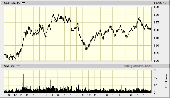
Since
last year, however, gold has embarked on a “silent comeback,” effectively
ending a four-year bear market. (See the
SPDR Gold Shares ETF chart below for illustration.) It has been consolidating its gains in recent
months as it prepares to continue its long-term rebound. The going has been slow for the most part,
mainly because inflation has been slow to return and equities continue to steal
some of the yellow metal’s thunder. If
the M2 velocity chart shown above is any indication, however, then inflation
should slowly increase in the coming years.
This would certainly brighten gold’s longer-term prospects and make gold
ownership more attractive to the average investor once again. A moderate amount of inflation, besides
boosting gold’s lure, would also help the middle class to recover even more.