Tuesday, December 13, 2016

Why collapse isn’t on the menu

The word “collapse” instantly conjures primal feelings of both fear and excitement whenever we hear it.  We fear it because it evokes our collective belief that collapse is fatal and final, yet it excites our imagination to the possibility, however, remote, that perhaps we’ll be among the lucky few to survive and even prosper from it. 

Whether in reference to a financial market crash or the collapse of government, the very idea has given birth to a plethora of writings on the subject.  Indeed, some of the top selling books in the financial literature category in recent years have had collapse as the subject matter, for writers instinctively know they can always count on a visceral reaction from their readers whenever they write of it.

Laying aside the fear it evokes, the study of collapse is a fascinating and rewarding endeavor.  Historians have long known what financial writers have only recently discovered, viz. that writing about collapse is a lucrative industry.  Consider the hundreds of books dedicated to the decline and fall of the Roman Empire, or to any number of past civilizations (Aztec, Egyptian, Babylonian, etc.).  One of the great preoccupations of writers of this genre is the guessing game of what exactly causes a society, or an economy, to collapse.  There is invariably no consensus among historians as to how, or even when exactly, it happens. 

Consider the famous example of ancient Rome.  What was it that actually precipitated the decline and fall of this mighty empire?  While there have been hundreds of reasons offered by specialists as to the cause(s), the most commonly assigned factors can be generally summarized as follows: 1.) Immigration and assimilation of foreigners (i.e. barbarians), 2.) Failure to continue expanding the frontiers via military conquest, 3.) Loss of personal discipline and liberty; 4.) Corruption on both the administrative and personal levels. 

Even if we accept any, or all, of these reasons as being legitimate, it still doesn’t answer the perennial question of what led the Romans to decide on making such a fateful decision.  In other words, what was the ultimate reason for the decline and fall?

Financial writers are plagued by the same lack of agreement as to what causes markets to collapse.  The reasons they offer range from the prosaic to the profound.  Most commonly they assume that a market collapse is the result of asset prices being “too high” or unsustainably expensive relative to valuation.  What many don’t realize is that demand for any given asset can extend well beyond the boundaries of normal valuation for years, or even decades, at a time.  We need look no further than the Treasury bond market to see an example of this. 

It has become fashionable among collapse historians to assume that collapse often occurs without warning out of a clear blue sky as it were.  Nothing could be further from the truth.  Collapses are invariably preceded by long periods of internal weakness, whether it’s the financial market or any other social system.  This explains why strong societies, much like strong markets, can withstand any number of external shocks without toppling.  It’s only when weakness is entrenched that one can expect external pressure to cause serious damage to a structure. 
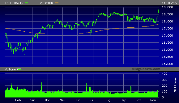
An example of this is the stock market plunge of late 2015/early 2016.  In the months leading up to it there was a sustained period of internal weakness and technical erosion in the NYSE broad market.  The number of stocks making new 52-week lows was well over 40, and often in the triple digits, which was a clear sign of distribution taking place in some key industry groups.  This weakness was evident in the NYSE Hi-Lo Momentum (HILMO) indicators, which depicted a downward path of least resistance for stocks.  The following graph is a snapshot of what the HILMO indicators looked like in the weeks just prior to the January 2016 market plunge.


This is also what stock market internal momentum looked like prior to the 2008 credit crash.  In fact, it’s what precedes every major collapse and it’s also a good representation of the internal weakness which takes place before markets, societies and empires collapse.  Look below the surface and you’ll always see the internal decay which paves the way for the coming destruction.  A healthy and thriving system, by contrast, is simply not conducive for a collapse to occur.

When we view the internal structure of the current NYSE stock market through the lens of the HILMO indicator, what do we see?  A market ripe for collapse?  Far from it, we see overall signs of technical health – even if the market isn’t firing on all cylinders.  Below are all six major components of HILMO.  The orange line is the longer-term momentum indicator, which is one of the most important one for discerning whether or not the market has been undergoing major distribution (i.e. internal selling).  It has been rising for several months now and is the polar opposite of what it looked like heading into 2016.


It would appear then that a collapse isn’t on the menu right now, at least not in the intermediate term outlook.  If it happens at all it will require a significant reversal of the market’s longer-term internal momentum currents, which in turn would likely take several months.  The weight of evidence suggests that the doom-and-gloomers who are predicting collapse are much too early and should save their apocalyptic warnings for a more propitious time.

Wednesday, December 7, 2016

The great middle class revolt gets bigger

With the U.S. presidential election now behind us, many investors feel they can finally breathe easy again after a nail-biting period of uncertainty since last year.  The rally in the major equity market indices since Nov. 9 has been in large part a relief rally of sorts and has been broad-based.  The sell-off in bonds has also been an indication of this collective relief. 

Despite the powerful stock market rally, not everyone is relieved about the election’s outcome.  There is some evidence that a large segment of the U.S. population is still feeling uneasy about the incoming president.  I’m referring specifically to the upper-middle class, which by some measures hasn’t expressed any enthusiasm in the way of increased spending patterns since the election.  Indeed, many in this socio-economic group have expressed an unwillingness to make major purchases until they see evidence that President-elect Trump’s policies are beneficial for the economy. 

The upper-middle class is roughly defined as those individuals that earn from around US$85,000 to $150,000 per year. Based on one measure of upper-middle class retail spending, they’ve noticeably curtailed their discretionary spending for at least the last two years.  Middle class spending also remains below its 2014 peak. 

Here’s a theoretical question: If it were possible to invest in either the middle class or the upper-middle class as if both were individual stocks or ETFs, which would you choose?  Logic would dictate the latter group since we are assured by economists that the upper-middle class has actually grown in recent years while the middle class has allegedly shrunk.  Moreover, upper-middle class members typically earn on average at least twice as much as the middle class average income.   So given a choice between the two, which do you think has performed better in the last couple of years?

The answer will no doubt surprise many of you; it’s the middle class.  Here’s what a middle class “ETF” would look like:


This theoretical class index is comprised of several companies which cater mainly to the middle class, including WalMart, Dollar General, McDonalds, Ford, and JC Penny.  Notice in the above chart that while most of the middle class-oriented stocks peaked in 2014, many of these stocks have actually held their own and have been trending more or less sideways since last year.  Some of them have even shown an upward bias since this year.

Now for the upper-middle class “ETF.”  Here’s the chart: 


As you can see, the upper-middle class hasn’t exactly felt ebullient since their discretionary spending peaked in 2014.  This index is comprised of stocks which cater mainly to members of the upper-middle, including Target, Starbucks, BMW, Whole Foods, Apple, and Chipotle Mexican Grill.  Evidently, the upper-middle class has felt less than enthusiastic in the last two years as the overall trajectory of most publicly traded companies who serve this sector has been, surprisingly, downward trending. 

This is not to imply that the fortunes of the upper-middle have been declining; economic statistics suggest the opposite.  Yet a distinction must be made when performing this type of analysis between having money and the willingness to spend it.  Clearly the upper-middle class has been, by and large, less willing to spend than in the years prior to 2015. 

It would be tempting to lump the trends shown in the above charts together and label them collectively as a great “middle class revolt.”  Undoubtedly that could be said about the way the middle class feels, for they made their grievances known in the recent election.  As I’ve demonstrated many times in the past, nothing is more devastating to the mass psyche than a prolonged sideways trend in the equities market.  The directionless stock market trend visible in the NYSE Composite Index (NYA) since 2014 is a case in point.  I believe that this, more than perhaps any other factor, has engendered the spirit of revolt among the middle class.


Human nature is so constituted that if progress isn’t evident over a certain period of time, people become restless.  The longer that people feel they aren’t progressing, the more restless they become.  This explains why, almost without exception, every political or military revolution in industrialized countries occurs after a prolonged trading range in that country’s equity market.  In the case of the U.S. middle class, it’s not that this class is actually getting poorer; rather, they only feel they’re not progressing.  The above middle class “ETF” chart only serves to underscore that belief. 

I would also make one more observation about both the above mentioned “ETFs.”  The middle class and upper-middle class charts suggest that investors in both classes have been underperforming the major averages.  Perhaps this is another factor behind the widespread notion that the middle class is “shrinking.”  While their collective earnings have either stayed the same or increased in recent years, their potential earnings (via the investment markets) have declined.  This can only feed into the growing sense of disillusionment that many within the middle class are feeling.  What comes as a surprise, however, is that the same might also be said of the upper-middle class. 

The next few months will be extremely interesting from the standpoint of middle class investor sentiment.  Should the middle class index fail to break out from its 2+ year trading range soon, the middle class may show further signs of discontent next year – especially if President Trump fails to deliver on his promises to the middle class.  

Moreover, a failure of the upper-middle class index to significantly reverse its downward trend fairly soon could potentially cause problems with the broader economy given their outsized impact on consumer spending. Needless to say, the next few months will be very informative on a number of levels.

Thursday, December 1, 2016

Will real estate tank in 2017?

In many ways, 2016 has been a banner year for U.S. real estate.  Housing prices continued to strengthen in several major metropolitan markets and even reached frothy proportions in at least three major markets.  Below the surface of an otherwise healthy market, however, lies a set of factors that could cause problems for the housing market in 2017.

Like most financial assets, home prices have been stuck in a sideways trend since 2014 and by all appearances weren’t going anywhere anytime soon.  The chart shown here from the Calculated Risk blog shows the CoreLogic Home Price Index from a yearly percentage change standpoint.  The dramatic increase in the tax and regulatory burden courtesy of the outgoing regime contributed to this standstill.  In the last several months it was the uncertainty over the November presidential election which contributed to subdued speculative activity in the financial markets. 


Now that the uncertainty has lifted to a large degree, asset prices are breaking out from their constrictive trading ranges, with many stock market sectors making nominal new highs.  Investors are hopeful that the incoming administration will be more pro-business than the last one.  Even real estate prices have ticked higher on a year-over-year basis, as shown by the above chart. 

With continued strength in real estate prices comes an increase in home equity wealth for homeowners.  According to CoreLogic, home equity wealth has doubled since 2011 to $13 trillion due mainly to the housing market recovery. Moreover, CoreLogic has forecast that a continued five percent rise in home values in the coming year would create an additional $1 trillion in home-equity wealth for homeowners. 

The current supply/demand balance for U.S. residential real estate is still favorable for a rising market.  Existing home sales and new home building permits are on the rise, with existing home sales rising in recent months by positive increments.  The National Association of Realtors recently reported that the supply of homes was a 4.5-month supply at the current level of sales.  This means that supply has decreased 7 percent in the past year.


Up until now the rally in bond yields (and fall in bond prices) hasn’t had much of a discernible impact on mortgage rates.  That may be in the process of changing, however.  The U.S. 30-Year Fixed Mortgage rate rose to 4.03% from last week’s 3.94%.  In doing so it pushed the year-over-year percentage change in the mortgage rate above the “zero” line and into positive territory.  Whenever this has happened in the past it tends to create weakness for the real estate-related stocks in the market.  It can even negatively impact the overall broad market for equities if mortgage rates continue rising over several months.  Rising mortgage rates can also be quite detrimental for the overall real estate sector if they persist long enough. 


It’s also worth pointing out that three-month Libor rates, which are the benchmark cost of short-term borrowing for the international banking system, have nearly tripled in the last 12 months.  As Steen Jakobsen of Saxo Bank has observed, “The Libor rate is one of the few instruments left that still moves freely and is priced by market forces.  It is effectively telling us that the Fed is already two hikes behind the curve.” 


My colleague Robert Campbell, who writes The Campbell Real Estate Timing Letter (www.RealEstateTiming.com) had this to say in his November newsletter: “Current real estate valuations are justified only if rates stay low – and if the Fed does raise rates in December as the financial markets currently expect, housing prices could start adjusting downward.”  This is certainly worth pondering as we head into 2017, especially if the interest rate uptrend continues.  

Real estate has been on a solid footing in the last few years but looks to encounter some turbulence at some point next year. The increase in market interest rates may well pressure the homebuilding sector, especially given the vertiginous levels which bond prices have soared to in recent years.  Any continued weakness in the bond market will only increase the pressure on housing loan demand. 

Tuesday, November 15, 2016

U.S. economy at major long-term pivotal point

As the dust settles from the U.S. presidential election, multitudes of political analysts and news commentators continue to scratch their heads wondering “what went wrong?”  The collective question they’re asking of course is in reference to the candidate who was elected President. 

This is the wrong question to ask, however.  What they should be asking is what led millions of (mostly) middle class voters to rise up against the favored establishment candidate and voice their disapproval with the incumbent party.  As is normally the case with anything relating to politics, the answer is to be found in the realm of economics. 

It’s no secret that the main source of the middle class revolt is that class’s overall lack of strong participation in the economic recovery of the last seven years.  Pundits have tended to put the blame for this squarely on the shoulders of middle class workers.  They never tire of repeating the mantra that the middle class’s skill set is fast becoming obsolete due to the evolution of technology and increased globalization.  This, though, has been true for at least the last three decades, so it hardly qualifies as a prescient insight. 

No, the root of middle class revolt is far more contemporary in origin and is much easier to isolate than the pundits think.  Let’s ask ourselves, in political terms, what is it that the middle class demands more than anything else?  The political philosopher Niccolò Machiavelli provided the answer to this rhetorical question centuries ago: the working class want nothing more than to be left alone by the ruling class.  In other words, they don’t want to be excessively taxed.

Without almost a single exception, any revolution in any country – be it political or military – has begun when the people were over-taxed and their cost of living became too high to support without undue strain.  It isn’t as much a lack of skills which has led to the middle class’s troubles as it is a drastic increase in their cost of living, thanks largely to an extraordinary increase in taxes in recent years.  And the main source of their tax trouble can be pointed to a single source, viz. the Affordable Care Act (a.k.a. Obamacare). 

Regardless of what your opinion might be as to the efficacy of this legislation, the undeniable fact remains that for millions in the middle class it has effectively drained their earnings by inflicting a hefty a penalty on those who don’t wish to purchase health insurance.  It enacts an even stiffer drain on consumers’ earnings by encouraging the young and healthy to purchase costly medical insurance when they don’t really need it. 

As Machiavelli himself wryly observed, history does tend to repeat and most political rulers fail to learn from its precepts.  One would think the Democrats would have learned a valuable lesson about forcing healthcare upon an unwilling populace in 1993, when the Clinton Healthcare Plan (a.k.a. Hillarycare) was first proposed.  It basically amounted to a forced attempt at socialized healthcare in the U.S., and it was staunchly opposed by millions of (mostly) middle class voters.  A vigorous initiative against the plan launched by the Christian Coalition effectively sealed the fate of the Clinton Healthcare Plan, allowing the economy a narrow escape from a substantial tax increase.

A rudimentary lesson of Economics 101 is that unwarranted taxes always hinder productivity to some degree or other, for taxes are a disincentive to produce.  The more taxes government implements to remove money from the pockets of wage earners, the less incentive they have to work hard and make even more money.  Thus the velocity of money decreases, which is the basis behind a sluggish economy (as we’ll see here). 

The Obamacare penalty must certainly rank as one of the biggest tax increases in U.S. history.  One simply cannot tax the American middle class like that and expect to that economic growth will continue unimpeded.  This is a big reason why the Democrats lost big in the latest election: it was the middle class’s repudiation of the Obamacare tax more than perhaps any other factor. 

Although the economy has certainly made significant strides since the depths of the Great Recession, there’s no denying that it hasn’t regained its luster from the heady years prior to the crash.  Economists often lament the lack of money velocity in the U.S., which is depicted in the following graph. 


Velocity is simply a measure of how quickly money is changing hands in the U.S.  The above chart is a snapshot of the annual percentage change in money velocity.  The picture speaks for itself and is a perfect reflection of the residual anxiety still very much present within the middle class economy.  Money simply isn’t changing hands fast enough among typical wage earners and this has kept the economy from what could have been a vigorous expansion. 

The blame for that can be put largely on the biggest tax increase in decades previously mentioned.  As long as the Obamacare tax remains on the shoulders of non-healthcare consumers it will continue to create a drag on the economy and prevent the kind of efflorescence historically associated with the strongest rebounds. 

Beyond the impact that the Obamacare penalty laid upon millions in the middle class, it has also had repercussions for investors and business owners.  The drag created upon business by Obamacare requirements has almost certainly contributed to the lack of forward momentum in the stock market these last two years.  It can be seen most clearly in the NYSE Composite Index (NYA), below, which is the broadest measure of the U.S. equity market. 


The breakout to new highs in several of the major indices, excluding the NYA, may indeed prove to be an anticipatory move in response to expectations that the Trump Administration will relieve business of its excessive tax and regulatory burden.  In order for the breakout to give way to a continued boom, however, this expectation should become reality.   

Now that Republicans control both chambers of Congress they have a chance to redeem themselves from their lack of a concerted effort against the Obamacare vote.  Regardless of whether they support the law remaining intact, to acknowledge the middle class constituents who voted for them they can, and should, send an undeniable message of support.  By eliminating, or at least significantly lowering, the penalty for not buying health insurance they will have given the middle class the best possible gift they can give.  In doing so they will be lifting a huge hindrance to the economy and allow it to truly take off in 2017.   

The 60-year economic cycle of inflation/deflation which bottom a couple of years ago hasn’t had a chance to work its magic on the U.S. economy by lifting the deflationary currents from the last two decades.  The early years of the new 60-year cycle tend to exert a benign inflationary impact by gradually lifting prices without creating the problems associated with too much inflation.  The up-phase of a new 60-year cycle also tends to stimulate consumer spending and investment within the economy due to the gradual increase of benign inflation.  Yet the cycle hasn’t been allowed to do its work thanks to the grievous burden of taxation imposed by Obamacare.  

If this tax is reversed by the incoming Congress, it’s highly likely that we’ll witness a magnificent flowering of the economy in the years that follow.  While the economic recovery since 2009 can be likened to foliar growth in a fruiting plant, the second and most important phase of the recovery must involve flowering.  Only then can the plant bear its fruit.  To date there has been much leafy growth, yet little flowering.  The stimulant required for this flowering is the lifting of the excessive burdens placed upon it by the previous caretakers.  

Thursday, November 10, 2016

What investors can expect from the Trump revolution

They’re calling it the Great Revolution, and rightfully so.  Donald Trump’s earth-shattering victory over Hillary Clinton on Nov. 8 must surely rate as one of the greatest political upsets in U.S. history.  It stretches the mind to recall the last time a true political outsider won the Oval Office.  The prospects of what an independently wealthy and politically unattached President can do for the country are tantalizing to consider. 

Let’s leave the hyperbole and political predictions to others, though, and focus on what little can be discerned in the wake of Trump’s historic win.  There’s a saying we’re all familiar with: “Don’t listen to what they say, follow the money trail.”  That bromide has never been more relevant than it is right now.  With that as our starting principle, let’s examine what the “smart money” thinks about Trump’s presidential victory.  They’re the ones, after all, who determine the financial market’s course and it’s their opinions that will likely prove most accurate. 

In the wake of Mr. Trump’s victory of the U.S. presidency we’re seeing an avalanche of predictions and commentaries from all sides of the political spectrum as to what the President-Elect will do once in office.  His opponents vehemently assert he will drag the country into an economic recession – or worse – with his proposed policies.  His supporters maintain he will restore American greatness and revitalize the nation’s struggling middle class.  Not in ages has there been a more polarized response among both sides of the political divide.

Since no one but Trump himself and perhaps a few insiders can possibly know exactly what his true intentions are, any attempt by outsiders such as me at predicting the coming months would be mere speculation.  That doesn’t mean we’re completely without guidance, however.  The old tried-and-true bromide that every successful investor knows by heart can always provide valuable insights on what likely will be next, viz. “The tape tells all.”

What exactly does “The tape tells all” mean?  It means that while individuals may cast votes on a ballot and share their opinions with pollsters, the only votes that really count are the ones they make with their money.  After all, when one’s hard-earned dollars are at stake you tend to think long and hard before placing your “vote” in the marketplace.  Campaign promises can be broken and good intentions are ephemeral, but investment decisions typically have bigger consequences.  As such, they tend to be made with far greater forethought and longevity than mere spoken words.  With that said, let’s examine what the smart boys and girls who vote with their dollars actually think about the prospects of President-Elect Trump’s upcoming reign.

One assumption that many held about a Trump victory was that the global markets would plunge and the economy would deteriorate.  Already there were some headlines appearing after the election forecasting a “Trump recession.”  The stock market “tape” doesn’t indicate that informed investors are concerned about the prospects of recession under Trump.  In fact, the market crash that many had predicted failed to materialize and instead a vigorous rally greeted Wall Street on Wednesday morning after the election.  The stock market gained 1.43% on Wednesday despite S&P 500 futures being down 5% at one point overnight.  This isn’t the money voting action of a group of insiders concerned about imminent recession or a bear market; it suggests that cooler heads have prevailed against last night’s emotional reaction in the futures market.


One of the best ways of anticipating a president-elect’s policies is to take notice which industry groups are outperforming in the days immediately prior to and following the election.  This technique works especially well if the industries in question have been underperforming for an extended period.  Again, the rationale behind this is that informed investors are better equipped than outsiders to predict a president’s trade and economic policy intentions.  Sudden and dramatic shows of relative strength prior to, and in the wake of, an election are signs that the insiders are buying stocks poised to benefit from those policies. 

A couple of weeks ago we discussed the strong performing defense sector and the implication it held for potential military activity in the coming 1-2 years.  While my assumption for this was predicated on a Clinton victory, a Trump presidency may still hold the prospects for militarism.  Note the stunning performance of the Dow Jones U.S. Defense Index (DJUSDN) on Wednesday in the wake of the election.  Defense stocks were one of the top-performing groups for the day as the Defense Index posted a 6.21% gain.  The smart money apparently sees the potential for military action even in spite of the President Elect’s dovish rhetoric. 


The financial sector has been a star performer since before the election and had another blowout day on Wednesday after the election.  Led by the big institutional financial firms like Goldman Sachs (GS), the bank stocks gained an average of 5% for the day while the broker/dealers were up 6% on average.  Here’s what the PHLX Bank Index (BKX) looks like as of Wednesday.  The index made a new 52-week high as you can see, quite impressive given that the average NYSE stock is still below a 2-year trading range ceiling. 


This is an important consideration since leadership and relative strength in the broker/dealer and banks normally carries bullish implications for the broad market.  It also tells us that, far from being disturbed by the threatening aspects of a Trump presidency, Wall Street (or at least a large faction of the Street) is apparently enthusiastic about the prospects for success under his administration.  Time doesn’t permit a more extensive analysis of the many industry groups and their reactions to Trump’s victory, but we’ll take a closer look at them in the next commentary.  

Wednesday, October 26, 2016

The next big catalyst for stocks/commodities

We’re about to enter that time when financial commentators offer up their best guesses as to what investors can expect in the Near Year.  It always makes for fun reading, but it also never fails to disappoint.  Instead of engaging in that tired exercise in futility, investors would do better to focus on something more productive.  And that would be next year’s most likely catalyst for stock and commodity prices.

Instead of asking the fruitless question, “At what price will the S&P 500 finish in 2017?” wouldn’t it be better to ponder what could possibly stimulate asset prices out of their lethargy?  Granted, this is as much a guessing game as the former question.  But at least applying critical thinking to the catalyst question, investors are almost certain to uncover some hidden opportunities for profit.

Having said that, what could be next year’s biggest catalyst for a meaningful breakout-type move in: the broad equities market, the commodities market, or individual issues within both categories?  Putting the pieces of global events over the last year together and reading between the lines allows us to make at least one educated guess: military conflict.  War is after all one of the biggest catalysts for both stock and commodity prices, and it has the added benefit of boosting the economy, short-term.  Of course war must be paid for down the line, but that’s why “kicking the can” was invented (so that the day of reckoning can be perpetually delayed). 

Terrorist events have historically served both as precursors and pretexts for going to war.  As the following graph shows, terrorism has expanded dramatically in recent years [Source: www.civilserviceindia.com].  The exponential increase in terrorist events will likely be used to justify further military excursions among the Western nations which have become the targets of these events.


Indeed, the rumblings of war have been audible for some time now, and it’s evident that what has kept the U.S. out of another overseas conflict has been the focus on this year’s presidential race.  The current Commander-in-Chief is bound by his promise to end America’s long wars in Iraq and Afghanistan.  The incoming president, however, will be under no such constraint.  If that president just happens to be a certain candidate with the initials H.R.C., it’s also likely that America will have its next war-time president. 

As Micah Zenko argued in his recent Foreign Policy article on Hillary Clinton, the presidential hopeful has a long track record which strongly suggests she is a war hawk.  “Though she has opposed uses of force that she believed were a bad idea,” he wrote, “she has consistently endorsed starting new wars and expanding others.”

While the U.S. has already been at war for 15 years, the intensity of our nation’s war efforts have been dramatically scaled back in recent years.  Under Clinton, it’s easy to foresee a revival of warfare activities in the Mid East region.  While Zenko’s article was supportive of Hillary in the role of chief military commander he also acknowledged that “those who vote for her should know that she will approach such crises with a long track record of being generally supportive of initiating U.S. military interventions and expanding them.”

The U.S. isn’t the only major country which will likely see military action in the intermediate term.  One region which of the world in which military activity may see a notable increase in the foreseeable future is the Far East.  Japan is a case in point.

Earlier this year, Japan’s Prime Minister Shinzo Abe has made a controversial call to revise Article 9 of the nation’s constitution, which declares that “the Japanese people forever renounce war as a sovereign right of the nation and the threat or use of force as means of settling international disputes.”  In view of China’s ongoing military buildup in the South China Sea and other threats, Abe has said the restrictions on Japan’s military “do not fit into the current period.” 

Bert Dohmen of the Wellington Letter observed that an amendment to Article 9 “would lead to a military buildup, which always stimulates the economy,” adding that “Japan could finally get out of its 25 year deflation” if Article is deleted.

In response to increasingly hostile behavior from nearby North Korea, Japan may also accelerate roughly $1 billion of planned upgrades to ballistic missile defense systems, according to Reuters.  This consideration comes shortly after United States Strategic Command systems detected a failed missile launch recently in the northwest North Korean town Kusong.  Japan has been considering the budget request that will determine whether to add a new missile defense layer from either Lockheed Martin Corp or from Aegis Ashore.

Defense firms like Ratheon, Lockheed Martin, Mitsubishi, and Boeing are reportedly on tight production schedules with a backlog of international orders.  Following is a 10-year chart of the Dow Jones U.S. Defense Index (DJUSDN).  As this graph illustrates, defense stocks have significantly outperformed the S&P 500 (SPX) in recent years.  The average stock price for the leading defense companies underscores the immense war-related preparations and activity taking place within the sector. 


All over the world, it seems, nations are arming themselves with the offensive and defensive weapons of war.  The production-for-use theory of economics states that military buildups always eventually lead to the employment of those weapons in actual warfare.  Sooner or later the expansive activity that has been taking place in the defense sector in recent years will be implemented on the battlefields of the world.  When it happens, investors who are prepared for it will not only avoid the deleterious aspects of war, but will also profit from it.

Friday, October 14, 2016

America’s 50-pound ball and chain

America’s economic condition is truly a “tale of two cities.”  Upper middle class and wealthy earners have never been more flush thanks in large part to the record liquidity creation of the last eight years as well as to their financial market exposure.

By contrast, the middle and lower classes have either stagnated or are struggling as perhaps never before, due in part to their under-exposure to the financial market but also to the erosion of their real estate wealth in the last 10 years. 

The turmoil for the middle class began with the implosion of the real estate market in 2006 and accelerating with the events of the two years following.  The deterioration of home values and the loss of employment imperiled the middle class during the crisis years, and while many the middle class have since recovered their overall fortunes have never complete rebounded to pre-2007 levels.

The upper classes meanwhile have shown remarkable recovery.  One such reflection of their ebullience is the following graph which shows the New Economy Index (NEI).  As can be seen here, the NEI has made a series of new all-time highs in 2016 and this is significant.  It shows that consumers – mainly in the upper middle and upper classes – have been quite prolific with their spending.  NEI is a forward-looking measure of the retail economy based on the leading publicly traded retailers, business service, and business transportation providers. 


Notwithstanding the strength of the upper classes, there is at least one major impediment to a full-scale middle class recovery.  A heavy burden is weighing down the middle class, a tax which hangs upon its neck like a 50-pound ball and chain.  The tax in question is the healthcare mandate of the Affordable Healthcare Act (ACA).  Under this grievous yoke, individuals and married couples making middle class incomes must pay anywhere from $700 to over $4,000 per year in taxes (for non-compliance) or for healthcare coverage, even if coverage isn’t desired.  The ACA has forced millions who previously didn’t want or need health insurance (which to them is a liability) into buying it.  If they refuse, they must pay a substantial penalty.

While pundits have argued that the ACA is “working” and has “fixed” the nation’s healthcare crisis, they fail to specify for whom the law “works.”  It has certainly helped lower income individuals who had difficulty gaining access to healthcare previously.  And it definitely doesn’t hurt the rich, for whom the ACA tax burden is barely felt.  Middle class wage earners and small business owners, however, are the ones who must shoulder the burden.

A cursory examination of the middle class economy will reveal that the healthcare taxes of the last 2-3 years have acted as a drag on consumer spending among middle class taxpayers.  It has also inhibited small business hiring to a degree and has even forced some business owners to close shop.

Even for those taxpayers for whom the ACA isn’t a debilitating burden, at the very least it provides a reason to restrain their discretionary spending.  The impetus toward reduced spending is reflected in the exceptionally low monetary velocity, as well as in the diminished fortunes of several old-line retail companies.  This can be seen in the following graph comparing the share prices of three major U.S. retailers: Macy’s (M), Gap (GPS), and Wal-Mart (WMT).


An argument can also be advanced that the directionless stock market of the last two years is at least partly attributable to the reduced participation of retail investors in the middle class.  There is no denying that retail interest in equities has dwindled appreciably since 2013 with a consequent loss of momentum.  Powerful bull markets require heavy active participation from retail investors, otherwise the market turns into a veritable closed feedback loop with institutional interests trading among themselves.  The end result is a stock market that goes nowhere like the NYSE Composite chart shown here.


The first priority of the next Presidential administration in 2017 should be to reform the ACA by lifting the crushing tax burden from the middle class.  Doing so would remove a big obstacle in the path to full economic recovery.  It would also provide the stock market a reason to finally break free from its restraints of the last two years.  Here’s hoping that the next President has teh wisdom to see it and the will to carry it out.

Thursday, October 6, 2016

Will the bull market remain intact in 2017?

The question confronting investors right now is whether the lateral trading range in the major indices represents consolidation of the long-term uptrend, which precedes an eventual upside breakout from the range?  Or does it represent distribution (i.e. selling) which precedes an eventual breakdown of the trend? 

Bulls and bears have assembled evidence to support their respective take on this conundrum, but the most basic and useful evidence suggests the first outcome, namely an eventual upside resolution.  Let’s examine the evidence in support of this conclusion. 

While the bears have correctly observed that in the previous instances when the major indices have bumped up against trading range resistance – or temporarily exceeded it – the market has always had a sharp decline.  It’s also true that during the sideways range-bound market of 2015 there was definite evidence that distribution was taking place among informed investors.   This preceded the July-August collapse last year and the secondary collapse in January-February of this year. 

All through the spring and summer of 2015 the list of stocks making new 52-week lows on the NYSE was growing.  It remained elevated well above 40 – the dividing line between a healthy and unhealthy market – for much of the year.  Anytime there is a stretch of several consecutive days where new lows are above 40 while new lows are shrinking it strongly implies internal selling pressure beneath the surface of the broad market.  This was one indication that distribution was taking place last year while the Dow and S&P were churning in a sideways trend.  Finally, after several months of this internal selling pressure the market broke under the weight of it, as can be seen in the following graph.


After bottoming in February the stock market has only seen a total of nine days where the new 52-week lows numbered 40 or above.  That’s an impressive stretch of internal health and it shows that there has been little or no selling urgency or distribution since then.  The dearth of new lows argues strongly, therefore, in favor of the longer-term bullish trend remaining intact heading into 2017.  

On a short-term basis, however, there has been a definite loss of momentum.  As we’ve reviewed in recent reports the NYSE short-term directional components of our Hi-Lo Momentum (HILMO) index keep deteriorating.  Here’s what the three components look like as of this writing on Wednesday.  The blue line is the short-term directional indicator, the red line is the momentum bias, and the green line is the internal trend.


The downward-slanted trend in the above graph is indicative of a loss of forward momentum on a near-term basis and explains why the major indices have been unable to rally in sustained fashion since peaking in August.  As long as the short-term momentum indicators are declining it will also mean the market is vulnerable to negative news and may at some point experience another pullback. 

Acting as a counterbalance against this short-term downward pressure is the longer-term internal momentum indicator, shown below.  Currently this is the only one of the eight major HILMO components that is rising on a sustained basis.  My interpretation of this graph is that as long as this indicator continues its nearly vertical climb it should act as a deterrent to a serious bear raid.  That has certainly been the case since July-August when the internal cross-currents first became evident.  It’s also why any attempt at short selling among the bears has ultimately backfired due to the strongly rising longer-term momentum current reflected in this indicator. 


So while the loss of short-term internal momentum may negatively impact the near-term trend, it shouldn’t prove fatal to the major uptrend that began in March-April 2009.  

Thursday, September 8, 2016

Will Deutsche Bank collapse the global market?

The past year has seen its fair share of worries.  From the China slowdown to the Brexit, successive waves of overseas fear have rolled onto our shores since 2015, yet none of them were the Tsunamis the bears had predicted. 

The latest foreign fear concerns the possibility for a global credit crisis led by the collapse of a major international bank.  A simplified summary of this scenario goes something like this:  Deutsche Bank is on the brink of bankruptcy and its insolvency could spark a systemic European banking crash.  This in its turn could send shockwaves throughout the global financial system, resulting in widespread economic turmoil on par with the previous worldwide crisis. 

Commentators who favor this outlook tend to illustrate their dire predictions with a graph of Deutsche Bank’s stock performance since last year.  It certainly adds a spark of credence to their argument based solely on the depth of the stock’s plunge. 


One commentator has gone so far as to assert that “if Deutsche Bank goes under it will be Lehmen times five!”  Other observers have expressed a similar concern, albeit in less alarmist terms.  The International Monetary Fund (IMF) labeled Deutsche Bank as the most risky financial institution.  The argument goes that since Deutsche Bank is linked with other publicly traded banks and insurance companies, it has the potential to be the source of another worldwide financial contagion should the bank collapse.

In 2009, Deutsche Bank CEO Josef Ackermann assured investors that it had enough money to survive a crisis.  Three years later, however, some of his colleagues said bank hid €12 billion of operating losses with derivatives.  “The first warnings that Deutsche Bank could declare bankruptcy emerged in 2013 when the bank said it needed additional capital,” according to sputniknews.com.  “In 2013, it attracted $3 billion through issuing shares for its stakeholders.”

In March 2015, a stress test revealed that the bank again needed additional capital.  It was also revealed that the bank manipulated with LIBOR, and in April 2015 it was fined for $2.5 billion.  Subsequently, the ratings agency Standard & Poor’s downgraded Deutsche Bank from A to BBB+, three positions above the junk rating. 

In early June 2016, Deutsche Bank was again involved in a scandal over LIBOR manipulation.  The case involved at least 29 personnel who worked in London, Frankfurt, Tokyo and New York.  Last year, Deutsche Bank reported a net loss of €6.8 billion for the first time since 2008.

Most recently, the bank made headlines last week when its Xetra-Gold exchange traded bond failed to deliver gold upon clients’ request.  This understandably sparked grave concern from many in the financial realm that Deutsche Bank’s back is against the ropes once again.

Could a Deutsche Bank collapse serve as the catalyst for a 2008-type global credit storm?  When analyzing this question one must be very careful from making dogmatic statements since no one (especially an outsider to the international banking industry) can possibly know all the variables involved.  There are, however, some guidelines that can help us understand the position of the broad market vis-Ă -vis the effects of an ailing global institution.   These guidelines should allow us to at least handicap the odds of a global financial meltdown.

One important guideline is the underlying strength and internal health of the financial market, notably the U.S. equity market.  In the months prior to the 2008 credit crash the U.S. stock market was exceedingly weak as evidenced by the sustained decline in NYSE internal momentum.  In fact, this is what the longer-term internal momentum indicator for the NYSE broad market looked like just prior to the 2008 collapse.


This internal weakness, combined with growing institutional weakness in almost all major sectors of the economy, meant that the U.S. was highly vulnerable to a financial shock.  When the Lehman Brothers collapse hit the market, the shockwaves were felt immediately and resulted in a domino effect.  In other words, internal weakness makes it far more likely that an exogenous shock to the system will prove devastating, if not fatal.

By contrast, an internally strong internal condition makes it far less likely that an exogenous event, such as the collapse of a giant bank, would derail the U.S. financial system.  Consider the experience of 1998 when the combination of the Asian currency crisis, the LTCM meltdown, and the near-collapse of the commodity market hit the U.S. stock market.  U.S. equities were in a raging bull market at that time and the financial market was internally strong.  The contagion hit our shores in the summer of ’98, and while it did briefly plunge the Dow and S&P into a malaise – within three months the major indices were off to the races again and finished out the year at new all-time highs.  The U.S. essentially shrugged off what would normally have been a catastrophic event due to its internal strength.

I would argue that the U.S. financial market finds itself in a similar situation today.  Instead of chronic weakness, the U.S. market is internally quite strong.  Witness the longer-term NYSE internal momentum indicator below.  As you can see, it’s in stunning contrast to the 2008 scenario shown above.


The late great historian and author Barbara Tuchman said it best when she wrote: “Social systems can survive a good deal of folly when circumstances are historically favorable, or when bungling is cushioned by large resources or absorbed by sheer size as in the United States during its period of expansion….[W]hen there are no more cushions, folly is less affordable.”    

The “cushions” she mentions are in place and are in the form of the rising intermediate-term and longer-term internal momentum previously mentioned.  If a Deutsche Bank collapse happens in the coming months – a mere conjecture to be sure – it would be very unlikely to collapse the U.S. given the prevailing internal strength.

Wednesday, August 24, 2016

Can stocks survive without stimulus?

A fiery debate rages among investors over the question of central bank stimulus.  The question is whether the stock market needs stimulus in order to advance, and is stimulus only creating a bubble which will burst at some point and lead to depression? 

Regardless of the philosophical rectitude of central bank intervention, there can be no denying its efficacy.  The most fundamental truth of the financial market is that “liquidity, liquidity, liquidity” is the market’s lifeblood.   Financial stimulus contains the seeds of recovery and will cure any bear market in equities, as I’ll attempt to prove in this commentary.  The truth of this assertion can be found in the very wisdom of King Solomon, who in the book of Ecclesiastes wrote that “money answers all things.”  Stocks will always, without exception, respond positively to stimulus – provide there are no countervailing obstacles in the way [e.g. tax increases, margin requirements]. 

Critics of stimulus often point to Japan as an example of how quantitative easing (QE) supposedly failed.  Seventeen years ago the Bank of Japan (BOJ) led all other central banks by more than a decade with its zero-interest-rate policy, when its benchmark rate was lowered to zero for the first time during March 1999.  As Dr. Ed Yardeni recently observed:

“The BOJ lagged behind the ECB by nearly 20 months, introducing its negative-interest-rate policy (NIRP) on January 29 of this year.  The central bank was early with QE when it expanded its reserves balance starting during November 2001 through January 2006.  That was just a warm-up act for the dramatic expansion of these reserves that started in early 2011, and then went vertical since late 2012.”

While Japan’s economic troubles remain, is it fair to assume that the BOJ’s attempts at stimulus were an abysmal failure?  Let’s examine the evidence.

Following is a long-term graph of Japan’s Nikkei stock index.  Japan’s attempts at QE started in late 2001 and ended in 2006.  Given the downside momentum that had been established in the Nikkei heading into 2001 – 11 years worth to be exact – it took some time before the first effects of the stimulus registered in the stock market.  By 2003, however, the Nikkei was on the up-and-up.  Japan’s central bank let their foot off the QE accelerator between 2006 and 2001, though, and this explains why the rally didn’t continue further.  The 2008 credit crisis only added to the Nikkei’s woes.


Then starting in 2011, the BOJ once again commenced QE at an even more furious pace than before.  This led to a much quicker improvement in the Nikkei, which zoomed to its highest level in over a decade.  Undoubtedly, Japan’s second attempt at QE would have been far more successful had not the government implemented an ill-advised tax increase.  This foolish measure heavily undermined the positive impact of QE and put the brakes on the Nikkei rally.  It also put Japan’s economy back into recession for a time.

A lingering problem for the European Union countries since 2008 has been the negative impact of years of misguided austerity policies.  European Central Bank (ECB) President Mario Draghi famously pledged years ago the ECB would do “whatever it takes” to reverse the deflationary undercurrents plaguing the euro zone.  But until this year the ECB failed to live up to that promise.  Late last year Europe’s central bank finally got serious and lowered deposit rates while extending its 80-billion-euro monthly asset purchase program. 

Positive results of the bank’s efforts to date haven’t yet been seen, though there are preliminary indications that many European bourses are establishing intermediate-term bottoms.  Much depends on the ECB’s commitment to QE in the year ahead.  By keeping the proverbial pedal to the floor for an extended length of time, the ECB may yet succeed in reversing the continent’s financial malaise.  However, if the bank makes the mistake Japan made by easing up on QE prematurely, the euro zone can expect to see a resumption of the economic malaise.

By far the biggest success story of QE has been the U.S.  The Fed’s unprecedented stimulus measures in the wake of the 2008 credit crash galvanized an historic rally in the stock market which brought recovery to the major indices in record time.  Since the U.S. essentially has a financial economy, any sustained recovery in financial asset prices must of necessity lift the economy sooner or later.  Thus the improvement in many sectors of the economy since 2009 can be attributed, at least in part, to QE. 

The evidence to date strongly suggests that stimulus played an integral role in fueling the mighty asset price recovery that began over seven years ago.  The Federal Reserve’s interventionary QE program was successful beyond anyone’s wildest guess when measured by the result of the equity and real estate markets.  And while many are quick to condemn QE as having been a failure at resuscitating the economy, the data would argue otherwise. 

But after about six years of easy money, the Fed brought its QE program to a close in late 2014.  After that the stock market as measured by the NYSE Composite Index (NYA), the broadest measure of U.S. equities, entered a prolonged sideways trend, which can largely be attributed to the loss of QE.  The loss of billions of dollars per month of liquidity for stocks was gone and with it the sustained forward momentum that fueled the market’s surge from 2009 to 2014.


Keeping the U.S. market buoyant since then has been a combination of factors.  Continued low interest rates coupled with huge inflows of cash from foreigners seeking a safe haven from the global crisis have been a huge benefit for equities.  The lack of competition from commodities and other assets has also helped.  This influx of foreign “hot” money has amounted to a de facto stimulus for stocks, so in essence the market is still receiving stimulus from afar. 

Stocks need stimulus in order to advance in the absence of a strong economy.  When the economy is strong investors need no prodding to put their excess earnings into equities with hopes of greater profits.  A strong economy also breeds confidence in the present and optimism about the future; it serves as a kind of natural stimulus for the stock market.

Ironically, central bank stimulus can also serve as a deterrent for small investors since they interpret the need for stimulus as confirmation that the economy is weak and needs assistance.  Thus the public sometimes lack the incentive to take risks when QE is in full swing.  It’s the professional investor who is sophisticated enough to read between the lines and buy stocks in a weak economy, provided there is stimulus.  This is the great paradox of a stimulus-driven bull market: only the few participate, yet it eventually benefits the many as the wealth generated from higher stock prices permeates the broad economy. 

The great unknown factor concerning QE is the outer limit of its success.  Just how successful can QE be in stimulating the economy?  A satisfactory answer to this question hasn’t yet been supplied.  Just when it looked like the financial market rebound from the 2009 low was ready to explode into a full-fledged runaway bull, the Fed took its foot off the accelerator.  Eventually the generous liquidity the Fed was supplying ground to a halt and the stock market responded accordingly as its forward momentum slowed exceedingly.  

Central bankers, it seems, have an inveterate fear of inflation.  Most of today’s voting Fed members came of age during the runaway inflation of the 1970s.  The memories of that harrowing experience continue to haunt them, and its influence is reflected in their policies.  The prevailing belief is that too much QE equates to too much inflation.  This is a fallacy.  The U.S. and global economies have been so significantly altered by demographic, social and political shifts in the last two decades that inflation won’t be a major concern for many years to come. 

The Fed could have doubled its asset purchases between 2009 and 2014 without creating any appreciable increase in inflation.  Instead it decided to stop QE before inflation even registered, which was tantamount to pushing a stalled vehicle up a hill only to stop pushing before the summit is reached.  It would have been exciting to see just how successful QE could have been had the Fed decided to gun for prosperity.  Instead, the Fed chickened out and ruined its best chance at delineating once and for all the outer limits of central bank stimulus.

The other objection to a full-throttle QE initiative is the widespread fear of creating another asset bubble similar to the real estate bubble that popped in 2006 and led to the credit crisis.  History and human nature testify that a catastrophic crash of the magnitude of the ’08 credit storm takes at least one entire generation (i.e. circa 20 years) to dissipate.  In other words, it takes the advent of an entirely new generation who didn’t experience the crisis to repeat its mistakes.  At present there is a complete absence of risk-taking behavior among the generation that experienced 2008.  That deep-seated fear of risk won’t disappear anytime soon.  Thus the “bubble that broke the world” isn’t going to happen again for a long, long time. 

The simple answer to the question, “Can stocks survive without stimulus?” is an emphatic “No!”  Stocks always need fresh injections of liquidity to gain ground and surge ahead.  Whether the stimulus takes the form of QE, fiscal policy or surplus savings is a moot point.  But stimulus in all its many forms must be present to propel equity prices ever higher.  And rising stock prices in a financial economy like the U.S. always creates a wealth effect.  Thus in the final analysis, stimulus is to everyone’s benefit.